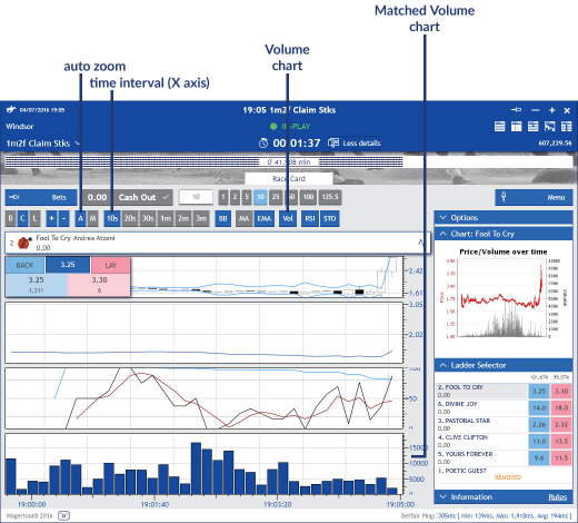
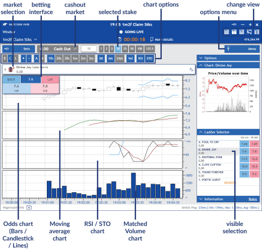
Chart view
The top part of this view is like those of the ladder and grid views (check 10.1). Similarly to these views, this chart view is also a betting interface. Note that all the charts in this view refer to a single selection of the market.
In the main area, you can have up to 4 Wagertool charts, apart from the common Betfair Price/Volume chart:
• Odds;
• Moving average;
• Relative strength
• Volume
On the top left corner of the main area there is a small betting interface with the best BACK (blue) and LAY (pink) odds available and the Last Traded Price in dark blue. You can place bets by clicking the BACK or LAY odd. But if you wish to place bets at different odds you can click the LTP to access a small ladder. Note that these are basic betting interfaces, so not all options are available, like betting with a right mouse click in the grid.
Specific to this view is the chart options bar:
• B C L: Bar, Candlestick or Lines;
• +/-: zoom odd in the top chart Y axis;
• A M: Auto/Manual scroll the horizontal time line, common to all charts;
• 10s 20s 30s 1m 2m 3m: horizontal time scale options for all charts;
• BB: Bollinger bands on the top chart;
• MA EMA: Moving Average and/or Exponential Moving Average;
• RSI STO: Relative Strength index and/or Stochastic Indicator;
• Vol: Matched volume chart.
Like in the grid view, there is a collapsible bets sidebar, in which you have access to a list of matched and unmatched bets of the market.
At the bottom, there is a status bar presented in all market views (Grid, Ladder, Multibet, Chart and All Markets), with information about Betfair connection time and a button to quickly save a screenshot of this window, which is useful to save and share interesting moments of the market.
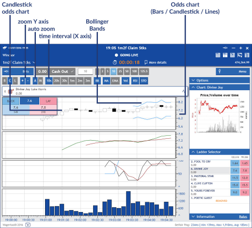
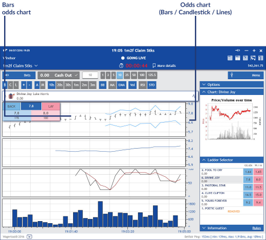
Odds chart (candlestick / bars / lines)
In the top odds chart the x axis corresponds to the time elapsed and the y axis to the matched odds.
This odds chart must always be open, but you can alternate between Candlestick, Bars or Lines.
The width of bars and candlesticks amounts to the matched odds for the chosen time period (10s, 20s, etc.). The smaller the time period, the more detailed the chart will be, so it’s perfect for short time tendencies. However, to better understand longer term tendencies it’s better to increase the time period.
You can activate/deactivate Bollinger Bands (click BB on the chart options bar) on this chart.
+/- only affect this chart and allow you to zoom in or out.
(A M) Auto and Manual affect all charts: Auto will scroll the time line automatically so the present time is always visible, while Manual allows you to scroll back and forward in the timeline.
On the top left corner of this odds chart there is a small betting interface with the best BACK (blue) and LAY (pink) odds available and the Last Traded Price in dark blue. You can place bets by clicking the BACK or LAY odd. But if you wish to place bets at different odds you can click the LTP to access a small ladder. Note that these are basic betting interfaces, so not all options are available, like betting with a right mouse click in the grid.
In the following image the candlestick option is activated:
The next image is an example of an odds chart with the bars option activated:
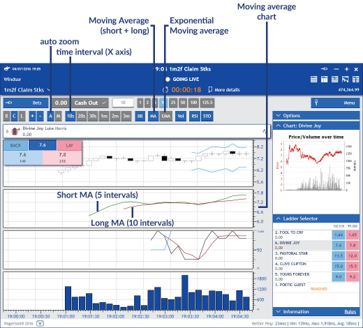
This second chart is shown when you activate MA or EMA in the chart options. The x axis corresponds to the time elapsed and the y axis to the matched odds.
• MA (Moving Average): shows short moving average (calculated every last 5 time intervals) and long moving average (calculated every last 10 time intervals);
• EMA (Exponential Moving Average): shows the exponential moving average line.
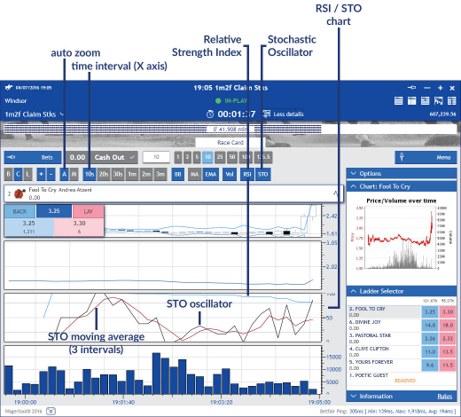
This third chart is shown when you activate RSI or STO in the chart options. The x axis corresponds to the time elapsed and the y axis to the RSI and STO percentages.
• RSI (Relative Strength Index): shows the short moving average (calculated every last 5 time intervals) and long moving average (calculated every last 10 time intervals);
• STO (Stochastic Oscillator): shows STO %K and %D (3 periods moving average).
This fourth chart is shown when you activate Vol in the chart options. The x axis corresponds to the time elapsed and the y axis to the amount of money matched (in the user defined currency).
Each bar represents the total amount of bets matched for the defined time interval.